Design plays a crucial role in shaping user experience and product success. As our product offerings expanded, so did the complexity of its design landscape and the need of a unified design system became essential.

Before creating design systems, Livspace faced several challenges due to the lack of a unified design language. These challenges impacted the company's design efficiency, consistency, and overall user experience.


These challenges highlighted the need for a unified design system to streamline the design process, ensure consistency, and deliver a seamless user experience across Livspace's products and platforms.
We embarked on the creation of two design systems to tackle the challenges of design inconsistency and streamline the design process. The goals for the design systems were as follows:


By implementing two design systems, Livspace aimed to transform its design process and deliver an exceptional user experience across its products and platforms.
The groundwork of effective design system
The creation of the design systems at Livspace involved a rigorous research and planning phase to establish a solid foundation for the project.


Building a scalable system that works for everyone
Following the comprehensive research and planning phase, the actual creation of the two design systems at Livspace commenced.
We recognized the need for two distinct design systems to address the varying requirements of our internal and customer-facing products.


Shared Foundation with Specific Adaptations:
Both Nest and Hive share a core set of naming conventions for tokens and components, ensuring consistency and facilitating collaboration between designers and developers. However, the function and UI of some components may differ based on the specific needs of each system. For example, a button component in Nest has a simpler design and fewer variants compared to its counterpart in Hive, which needs to accommodate additional functions and data states.
.png)

Color contrast is important for users to distinguish various text and non-text elements. We strive to meet the recommended contrast ratios shown below.


The recommended target size for touchscreen elements is 7-10mm. For most platforms, we considered making touch targets at least 48 x 48dp which results in a comfortable physical size of about 9mm, regardless of screen size.


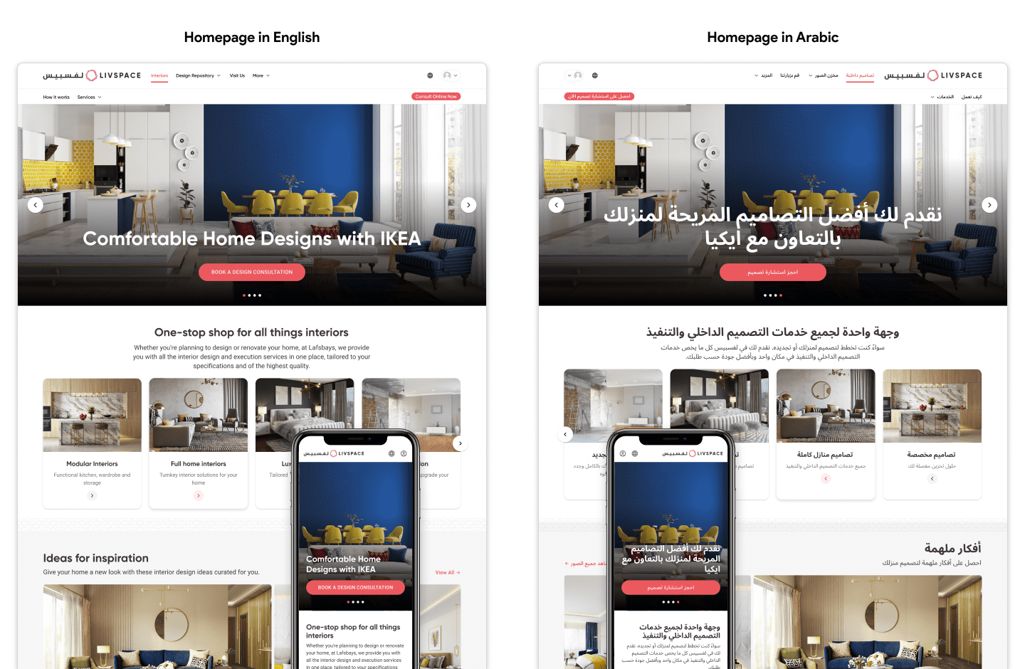
Recognizing the diverse needs of our users worldwide, we prioritized Right-to-Left (RTL) support from the very beginning. This proved particularly impactful when we expanded our operations to Saudi market, allowing us to seamlessly adapt our design system and create a consistent, engaging experience for users accustomed to RTL layouts.
We selected Noto Sans typeface, not just for its elegant design, but for its extensive support for regional scripts, including Arabic. This choice ensured clear and beautiful text rendering across a multitude of languages and writing systems.

To cater to RTL layouts without compromising our core design language, we established separate theme and style libraries. This allowed us to switch font families while maintaining design token consistency, preserving brand identity and visual harmony across different reading directions.

Streamlining development for RTL contexts, we built a dedicated component library. This library featured components specifically designed and configured for right-to-left layouts, from buttons and navigation menus to form fields and text blocks.

Cross-team collaboration for a unified design system
We recognized that building and maintaining a truly successful design system required collaborative efforts beyond just the design and development teams. We actively partnered with brand, creative, and marketing teams to ensure our design systems met not only technical requirements but also aligned with our brand identity and communication goals.
Co-creating Brand assets :
We partnered with the brand team to develop brand assets like logos for various internal products. This ensured cohesive visual identity and brand recognition across all platforms.
Building a Brand Style Guide :
Collaboration led to the creation of a comprehensive brand style guide that defined logo usage, color palettes, typography, and other visual elements. This guide served as a single source of truth for all teams working on branded assets.

Engaging Illustrations :
Partnering with the creative team, we developed custom illustrations for landing pages, empty states, and emailers within the design systems. These illustrations added a touch of personality and enhanced user experience across various touchpoints.
UX Copywriting :
We worked with the marketing team to develop consistent UX copy and ensure the design system elements were seamlessly integrated into marketing campaigns and promotional materials that aligned with the brand tone and voice. This ensured smooth communication of messages and a coherent user experience across all interactions.

Component-Level Roadmap:
A clear roadmap was created to visualize the development status of each component, indicating its readiness across different platforms. This roadmap was prioritized based on project needs and facilitated efficient resource allocation.

Continuous Feedback Loop :
Regular workshops and feedback sessions ensured the design systems met the needs of developers. Developers actively participated in testing and providing feedback on components and style guides, leading to technically feasible and user-friendly design systems.
Common language - Design Tokens :
Implementing design tokens maintained a common language between designers and developers. By ensuring consistency in variables and design values, design tokens reduced errors, streamlined communication, and enhanced maintainability.

Fuelling design system success
We understood that crafting robust design systems wasn't enough. To truly unlock their potential, we needed comprehensive documentation, strong adoption, and active contribution. This trifecta formed the engine of our design system journey, ensuring efficient utilization, widespread use, and continuous evolution.
We prioritized comprehensive, accessible documentation as the single source of truth for our design systems. We achieved this with the help of Zeroheight and Storybook. This included:

Widespread adoption was crucial for maximizing the benefit of our design systems. We fostered this through:

We encouraged active contribution to the design systems through a defined contribution model. This model encouraged active participation and streamlined how users could enhance the systems:

The tangible impact of our design system
With the implementation of our design system, we have achieved significant results and accomplishments. We deployed it to select products in a controlled pilot program, a testing ground to observe its impact and gather insights. This measured approach allowed us to witness the impact of the system before confidently scaling it across other products.
We used UX scorecards to assess the overall usability of the product before and after implementation of design system as well as to track usability over time.
The task-level metrics demonstrated improvements in success rates, and ease of usage across various workflows. Given below are results from the pilot project - 3D studio.

Embracing key learnings and challenges from this project
.svg)


The design systems have been a resounding success, enabling us to create consistent, high-quality user experiences across various products.


