
For better context, let's start with a brief understanding of the company and home interiors quote, the problems faced in the current process, and the objective of the project.
Livspace is Asia’s largest and fastest-growing omni-channel for everything home - ranging from home interiors, renovation, home services, furniture and many more. Using its proprietary technology, Livspace provides a one-stop solution for homeowners—from design to managed last mile fulfilment for all rooms in a home. The platform has organised a fragmented industry, bringing together designers, brands, manufacturers and contractors to enable an eCommerce-like trusted and predictable experience.
Livspace currently serves 40 metro and non-metro cities in India. It also serves in Singapore , Malaysia and recently launched in KSA. Livspace has delivered 50k+ homes, completed 13k+ services and sold 100k+ products.
Quotes are estimates from design firms/professionals outlining project scope, materials, costs, timelines, and warranties.
Home interiors quotes are provided to customers after an initial consultation either in person or over call, during which the interior designer assesses the customer's needs and preferences, and discusses the options for improving the home's interior. The quote is intended to provide the customer with an idea of the cost and scope of the project, and to help them make an informed decision about whether to proceed with the work.


We were facing a major issue with the customer quote. The current quote experience was outdated, had usability issues and confusing for customers, leading to a high abandonment rate and lost sales for the company. The current experience made it difficult for customers to understand their project quote and made it difficult to confidently proceed ahead. This caused frustration among customers and resulted in a poor customer experience.
The goal of this project was to redesign the customer quote to make it more user-friendly and efficient for both the customer and the company. The objective was to simplify the process, provide transparency in costs, and make it easier for customers to move forward with their projects. This in turn will lead to higher booking conversions.
Understanding user needs was crucial. In-depth interviews with customers and designers, design analysis, and data/behavioral analytics revealed pain points, patterns, and market trends.


Analyzing the current design to inform and inspire the new design approach.
The worst thing one can do is to take the current design and create a new one based on personal preferences. There was probably a ton of thinking and research that went into the creation of the original solution. Here the goal was to carefully inspect the current design, try to understand how it works, and the intention behind each decision. While at the same time understand the issues in the current design.
The next step was to know the performance of the existing design. Since we were doing a redesign, we had the luxury of learning from analytics and checking the real design performance without subjective judgments. Usage data is the most persuasive argument to justify design decisions with stakeholders and a baseline that can be used to compare the new design performance.
Before evaluating the performance of the quote, we aimed to comprehend the overall cancellation trends for projects. Project cancellations primarily stemmed from budget concerns and lack of transparency in quotes. Most cancellations happened after the quote was shared, and during the design finalization stage.
This suggests that customers either didn't like what was proposed in the quote or they failed to fully comprehend the details included in the quote.


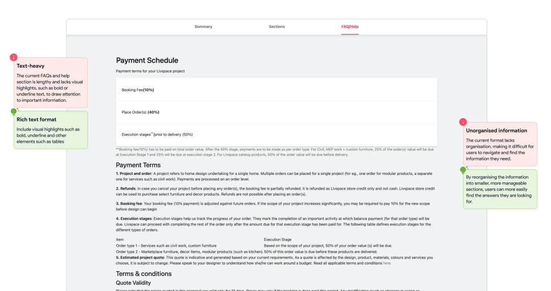
Our analysis revealed a 70% drop in user engagement before reaching the "Room sections" stage, indicating a significant issue in the discovery process. Additionally, there was a further 50% drop in engagement at the "Room detail" pages, suggesting potential issues with the presented information's clarity, complexity, or relevance to user needs.

Data analysis revealed key user pain points: confusing navigation, lack of information, and unappealing design. Our redesign tackled these issues by streamlining navigation, providing clearer information, and improving aesthetics, ultimately aiming to enhance user experience and boost conversion rates.

We leveraged behavioral analytics to grasp user behavior on our platform, tracking every interaction for deeper insights. With the ability to see beyond standard web metrics like pageviews and bounce rates, we were able to fill in the missing knowledge gaps and identify areas for improvement in the user experience.
We utilized Hotjar to monitor all user behavior. We analyzed heatmaps of key metrics like scrolling patterns, mouse clicks, and mouse movements.
Hotjar's user recordings provided invaluable insights into actual user interactions, going beyond assumptions or limited testing data. By observing how users navigated the site, what they sought, and what caused frustration, we pinpointed key areas for improvement. Analyzing these recordings allowed us to identify disruptions in the user journey and make informed design decisions based on real user behavior.

With insights from analytics, we thoroughly examined the existing design to uncover key problem areas, including usability issues, visual flows, bugs, and inconsistencies. Conducting a heuristic usability evaluation enabled us to systematically review the design against established heuristics and best practices, identifying potential usability issues and areas for improvement.


Unlocking user insights, our journey through research.
We conducted a comprehensive user research study which included both user surveys and interviews to better understand the needs and expectations of our users. Through this research, we were able to identify the pain points of users and the features they would like to see in a new design
We designed a user survey to gather quantitative data from a broader pool of users on the customer's experience with the current quote process. We also designed and conducted another survey with interior designers to understand the issues and expectations from their point of view.


We conducted in-depth user interviews to gather qualitative data from a smaller group of actual customers who had previously gone through the quote process, as well as designers who were involved in the process. We carefully selected participants who had recently received a quote and willing to discuss their experience in detail. The interviews were conducted over video calls and focused on understanding the user's needs, expectations, and pain points with regards to the current quote process.


Exploring the landscape: A study into the practices and trends of the market
It’s one of the first natural questions that comes to mind. “Well, what are others doing?” As our customers will have to choose between our solution and its alternatives, we needed to analyse other solutions and experiences available to customers.
We conducted a thorough analysis of direct and indirect competitors to gain a better understanding of the market. We began by identifying the key players in the market who offer similar services to our product. We then analyzed their offerings, business models, reviews, and user experience.

Current practices in the interior design industry involve using various software applications and tools for creating quotes and estimates for customers. These tools range from basic spreadsheet programs such as Microsoft Excel and Google Sheets to specialised interior design software with built-in quote and estimate creation features.

Interior designers and their teams typically spend significant amounts of time creating detailed quotes and estimates, which are usually presented in a tabular format. These documents include a detailed list of all the components required for the project, along with the associated costs and any other relevant details such as warranty information.
Once the quote or estimate is finalised, it is typically shared with the customer in a PDF format, either by email or through a shared file-sharing platform such as WhatsApp or Telegram. However, customers often find it difficult to understand the complex technical terms and jargon used in these documents, leading to confusion and misunderstandings.

Studying current market practices provided an understanding of the competitive landscape, industry trends, and customer expectations. This information helped to inform the research, design, and evaluation phases of the project, and helped us to identify best practices and innovative solutions that could be applied to the redesign of the quote process.
Transforming user research into actionable insights for informed project planning.
The research phase provided us with valuable insights into our target audience, their needs, and the market trends. To make the most of this research, the next step was to synthesize the data and draw insights that will help us develop user personas and inform our product development strategy.

One of the key outputs of our research and synthesis process is the creation of user personas. These personas are fictional characters that represent the different segments of our target audience. By creating these personas, we were able to better understand the needs and motivations of our users, which helped us to develop a product that meets their needs and expectations.

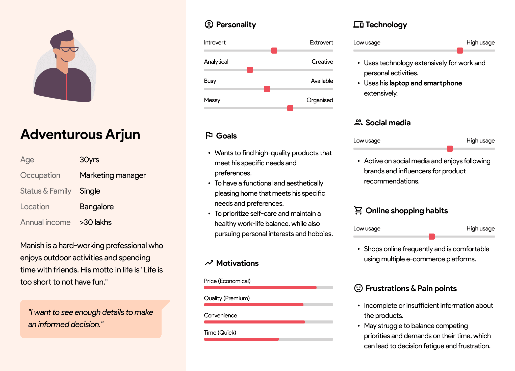

These personas served as a reference point throughout the product development process, guiding our decisions and ensuring that our solutions are relevant and effective.
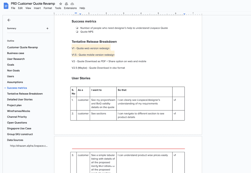
The insights from research, analytics, market study, business needs and the user personas formed the foundation for the final Product Requirements Document (PRD) and project plan, ensuring that the new product addressed user needs, met business requirements, and was competitive in the market.
In addition to user personas, we also added user stories to the PRD to ensure that the product was designed with the user in mind.
By creating user stories, we were able to better prioritise which features were most important to include in the initial launch and which could be considered for subsequent releases. This process helped us to refine the goals and non-goals of the project and create a more detailed project plan.
Building a solid foundation: Organizing content and designing navigation for seamless user experience.
Now that we had thoroughly analyzed and synthesized the research, including user personas and stories, that helped us form the product requirements document (PRD), it was time to start creating the information architecture (IA) for the project.
This involved categorizing and prioritizing content, creating a sitemap, and designing a navigation system and user flows.

User personas were crucial in defining the architecture elements of the project. They provided a clear understanding of the target audience and their needs, preferences, and pain points. This understanding helped in grouping and prioritizing content, as well as creating a sitemap and user flows that aligned with user goals and expectations.
To create a strong information architecture, we prioritized and categorized content, addressing gaps and streamlining elements as needed. This involved reviewing the existing content and determining which items were essential and which could be removed or consolidated. Utilizing a taxonomy, we organized items for easy navigation, informed by user personas.

After categorizing and prioritizing content, we developed a comprehensive sitemap outlining the structure of the quote site. This ensured all essential information was accounted for and easily accessible to users. The sitemap served as a tool to identify and address any gaps or inconsistencies in the content, enhancing the overall intuitiveness of the navigation system.

After creating the sitemap, we began to work on the navigation system and user flows for the quote site. We wanted to ensure that users could easily find the information they needed and navigate through the site without any confusion.

To ensure that the navigation system was intuitive and easy to use, we paid close attention to the language and labeling used in the navigation system. We used terminology that was familiar to users and accurately reflected the content of each section, while also ensuring consistency throughout the site.
For each item on the detailed list, we created a detailed product page that opened in a new tab. For modular items, the detailed page included a list of modular components for greater clarity. This made it easy for users to understand what they were getting and to make informed decisions about their purchase.
Crafting user-centric designs through thoughtful ideation and iterative testing.
During the design phase, we focused on translating the research and architecture into a visually appealing and user-friendly interface.
We started by crafting low-fidelity wireframes to outline the interface's basic structure. Through iterative refinement and user feedback, these wireframes evolved into a higher-fidelity prototype suitable for testing. User testing sessions provided valuable insights, allowing us to fine-tune the design iteratively. Ultimately, this process led to the creation of a final design that not only met the needs of our target users but also aligned with our project objectives.
.png)
We had a well-defined branding guideline that encompassed the organization's core values, mission, and target audience which was already used throughout Livspace website. This guideline provided clear instructions on the appropriate use of logos, colors, typography, and imagery, enabling us to establish a strong brand presence and evoke the desired emotions in users.

In addition, we developed a comprehensive design system that served as a foundation for all design elements within the website. This design system included a harmonious color palette, a carefully selected typography hierarchy, and a library of reusable components. By adhering to these predefined styles and components, we ensured consistency and efficiency in the design process, saving valuable time and effort.

Check out the entire project on how we built this design system 👇
The utilization of branding and design system guidelines not only enhanced the visual appeal of the page but also reinforced the brand's identity and instilled a sense of trust and familiarity in users. It allowed for a coherent and polished user interface, elevating the overall user experience and facilitating intuitive navigation.
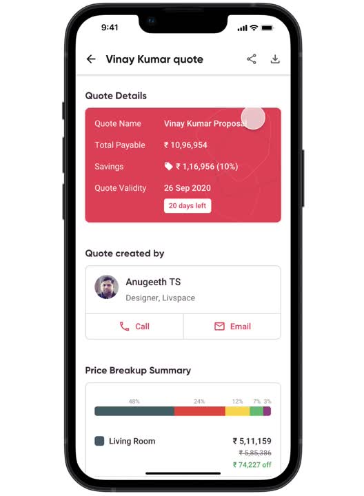
The design of the quote was optimized for mobile devices, with a responsive layout that adjusted to different screen sizes. This was done to ensure that customers could access the quote on any device, whether they were at home or on the go.
After conducting research on market practices, we observed that many studios and designers commonly provide interior quotes in a tabular format generated using tools like MS Excel and Google Sheets. Recognizing the familiarity and simplicity associated with this format, we decided to leverage it in our design approach.

By adopting a tabular format, we aimed to create a seamless and intuitive user experience. Users would find it easy to comprehend and navigate through the quote information, as the structured layout allows for clear organization and presentation of data. This decision also facilitated efficient comparison and evaluation of different items, enabling users to make informed decisions regarding their interior choices.

Furthermore, we implemented a single-page scroll design approach, where different room sections and their respective item tables or lists were consolidated on a single page. This approach eliminated the need for users to navigate back and forth between multiple pages, reducing confusion and enhancing the overall user experience. Users could conveniently scroll through the page, accessing all the necessary information in a cohesive and streamlined manner.
We recognised that users have varying preferences when it comes to the amount of information they desire. To cater to these diverse needs, we implemented a multi-tiered approach in presenting the quote information.

The inclusion of different levels of detail aimed to strike a balance between providing a concise overview and offering comprehensive information. It empowered users to choose the level of depth they desired, ensuring flexibility and catering to individual preferences. Whether users preferred a quick overview or a more in-depth analysis, the design accommodated their needs, enhancing their overall experience and facilitating confident decision-making.
The summary view served as a high-level overview, offering a concise and simplified representation of the quote. This allowed users who preferred a quick glance or a general understanding to obtain the necessary information at a glance. The summary view highlighted key components, pricing, and relevant terms, providing a snapshot of the quote's essential aspects.

On the other hand, the detailed view catered to users seeking more comprehensive information about individual products. By selecting the detailed view, users could access a deeper level of detail, including specific specifications, descriptions, and additional information for each item or product. This allowed users to make more informed decisions by understanding the intricacies and nuances of each element within the quote.

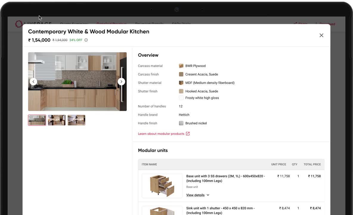
Designing the modular product detail page was a challenging task. The modular product presents a unique challenge for users due to its intricate nature.
To create a seamless solution for modular products, our first step was to gain an understanding of what modular products entail and how they are perceived in the real world. Within a modular unit, several components come together to create a functional and aesthetically pleasing piece. Each component plays a vital role in the overall design, functionality and cost of the unit.
The primary component is the carcass, which serves as the main frame or structure of the modular unit.
The next essential component is the shutters. These are the outer covering of the unit, adding style and visual appeal. Shutters come in various designs, materials, and finishes, allowing users to personalize their modular unit according to their preferences.
Handles, hinges and channels are used to ensure smooth operation and ease of use.

We recognized that different users had distinct levels of interest in the details of a modular product, ranging from an overall view to specific unit specifications.


For users seeking a comprehensive understanding of the entire modular product i.e. kitchen, we created a concise overview of the materials, brands, and finishes used throughout. This allowed them to quickly grasp the key information about the modular product as a whole.


To address the requirements of users desiring a list of all modular units, we added an extensive list of modular units such as base units, sink unit, wall unit, and microwave unit. Users could easily navigate through the list to explore each unit individually.


For those seeking in-depth information about each unit, we ensured that the detailed page/modal provided an array of details. Users could access specific information about the carcass, shutter materials, handle materials, brand, and finishes for each unit. This level of granularity enabled users to make informed decisions based on their preferences and requirements.


By designing the modular product detail page in this manner, we aimed to provide a seamless user experience that accommodated varying levels of interest and information needs, empowering users to explore and understand the modular product in a way that suited them best.
Recognizing the diverse needs of our users worldwide, we prioritized Right-to-Left (RTL) support from the very beginning. This became particularly crucial during our expansion into regions like Saudi Arabia, where RTL layouts and Arabic script are prevalent. This was facilitated by our robust design system.

The design process involved multiple iterations, with feedback and testing at different stages. This iterative approach allowed us to incorporate feedback from users and stakeholders and create a final product that met the needs of both customers and the business.

Measuring the impact of enhancements and improvements on quote
Increased engagement :
Since the project implementation, we've observed a significant increase in quote engagement. The number of active users has grown by approximately 26%, with a corresponding rise in sessions and projects. Livspace mobile app also saw a spike in usage, major factor being the introduction of mobile friendly layouts leading to higher user engagement.
We conducted testing with a diverse group of users. Participants were tasked with navigating the quote and completing specific assignments, allowing us to measure success rates and identify any potential pain points.
To quantify our findings, we employed the UMUX (Usability Metric for User Experience) scoring method, assessing the overall usability and satisfaction. The results demonstrated a significant enhancement in user experience, validating the effectiveness of our design decisions.

The outcomes from these comprehensive tests not only validated our design choices but also provided essential insights for any necessary refinements, ensuring the next product iterations resonated optimally with our users.
Users have expressed their satisfaction through positive feedback. Users now find it more useful.

We gathered additional user feedback to understand further needs, suggestions for improvement, typical quote expectations, and identify any existing gaps.
The impact on project and quote conversions is evident, with a spike increase of approximately 60% in conversion rates in one month. The time taken for converting the shared quotes to booked also reduced significantly. While the changes to Customer quote might not be the only reason for this improvement but this positive trend signifies the effectiveness of the project in improving the overall project and quote conversions.

Cost optimization : The project has successfully contributed to general cost optimization efforts, enhancing operational efficiency without compromising quality. While specific financial figures remain confidential, the positive impact on cost-related metrics is evident.
Increase in revenue : A general overview of the positive influence on revenue can be noted, reflecting an increase in revenue-related metrics without disclosing specific monetary details.
Embracing key learnings and challenges from this project


As we wrap up, our work doesn't stop here. We'll keep an eye on how things are going, listen to what users have to say, and keep making things better to improve the experience.


